Introduction
As the title suggests, this post explores the powerful generalized additive models to model time-series data. More often than not, we associate modeling time-series data with forecasting i.e, understanding the underlying data generating process to then forecast the future.
However, we could also be interested in understanding the nature of the current time-series, and also, comparing different time series. A recent client of ours came to me with an experiment where they were comparing 3 different formulations of an oil, and the adsorption was measured every second for 4500 seconds. They wanted to understand whether these different forumaltions differed in their absolute adsorption, but also, whether the rate of adsorption was different. Their data was highly non-linear, and a linear time trend would severly underfit the data.
Enter Generalized Additive Models
I’m an avid reader of Dr. Gavin Simpsons’s blog and papers, and he’s written a whole lot about generalized additive models here and here. In the paper he pretty much describes exactly what I needed!
His package gratia has very convenient functions to do everything I will describe, but we’ll use the powerful brms library to perform this analysis in a fully bayesian way.
The post below will describe two things -
1. How to model a time series using splines within a bayesian framework
2. How to estimate the trend
3. How to estimate the periods of change - the first derivatives of the trend.
Side note - I’m always amazed at the open source contributions. None of the stuff below would have been possible by Simon Wood’s unbeleivably powerful package mgcv- it’s an incredible library and I’m yet to grasp all of it’s use cases.
Back to business - let’s load in the libraries we need.
## Libraries
library(dplyr)
library(magrittr)
library(ggplot2)
library(brms)
library(mgcv)
Simulate data
The mgcv library has a really neat function gamSim, which let’s you simulate non-linear data. Let’s simualate some data, and use the eg 4, which simluates data by group (3 groups by default). For more information on this check out the spline help page
set.seed(08242019)
dta <- mgcv::gamSim(eg = 4, n = 2000, scale = 2)
## Factor `by' variable exampleVisualize the data
dta %>%
ggplot(.,aes(x0,y, group = fac)) + geom_point(aes(color = fac))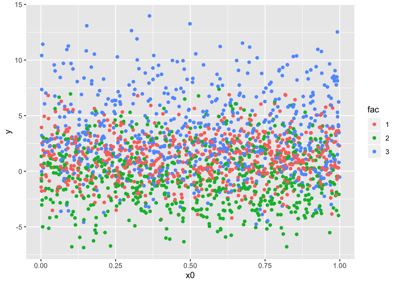
dta %>%
ggplot(.,aes(x1,y, group = fac)) + geom_point(aes(color = fac))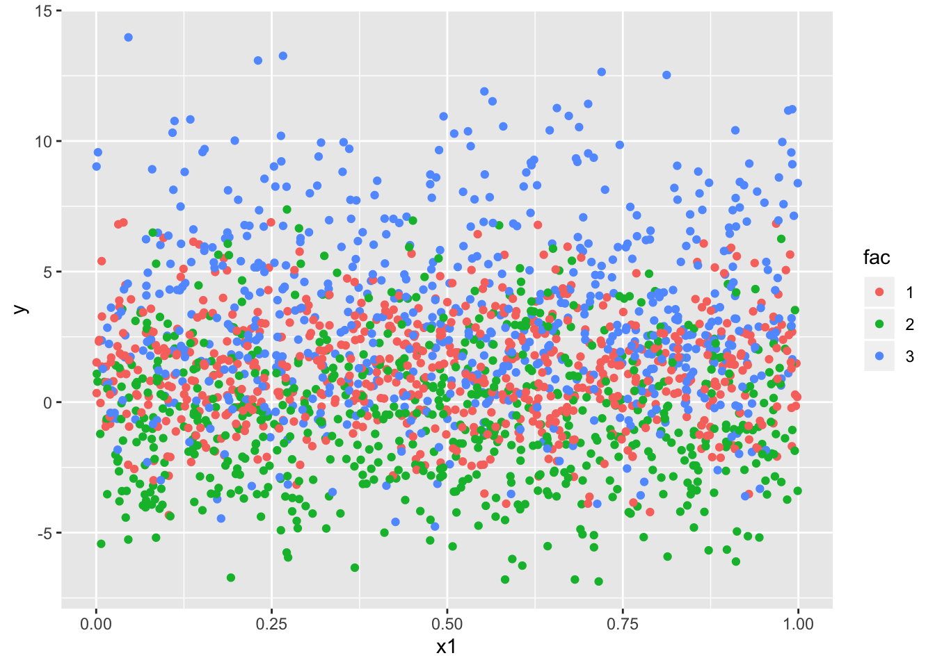
dta %>%
ggplot(.,aes(x2,y, group = fac)) + geom_point(aes(color = fac))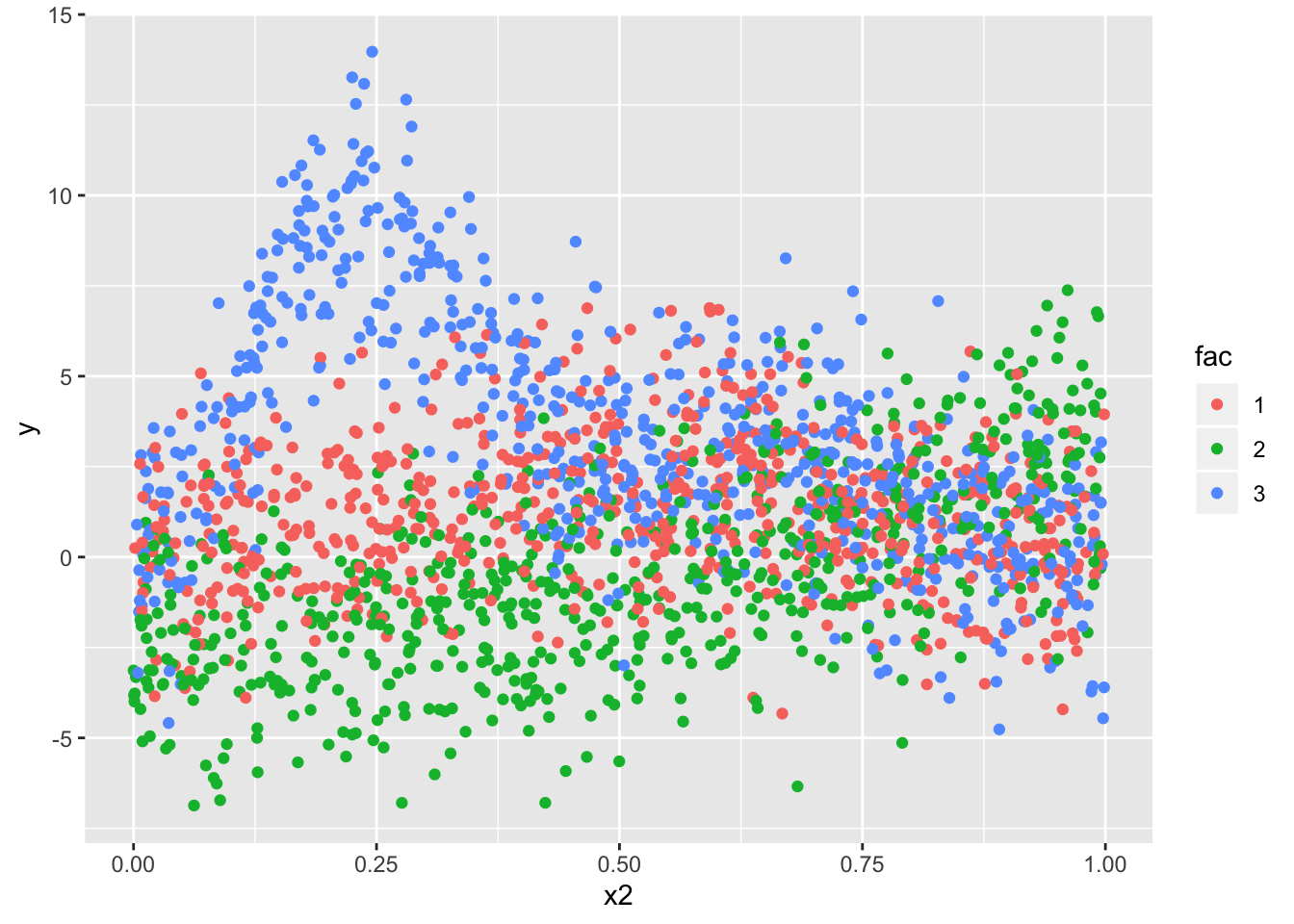
For simplicity purpose, we’ll model only the relationship between y and x2 - this seems to be the most non-linear and is a good usecase for us.
Model
Just so we can set better priors, we’ll scale the outcome to have zero mean and unit variance. We’ll leave x2 as is - it is bounded [0,1]. And we convert the grouping factor to factor.
In the choice of splines, this post is too short to go over the splines - but we’ll be using cubic shrinkage regression splines. (argument bs = "cs" in the spline term)
dta_scale <- dta %>%
  mutate(y_scale = scale(y), fac = as.factor(fac))
mod <- brms::brm(
y ~ (1|fac) + s(x2, by = fac, bs = "cs"),
data = dta_scale,
chains = 4,
cores = 2,
prior = c(
prior(student_t(3, 0, 1), class = sigma),
prior(student_t(3, 0, 1), class = sds),
#prior(student_t(3, 0, 1), class = b),
prior(student_t(3, 0, 2), class = Intercept)
), control = list(adapt_delta = 0.95), iter = 2000
)
saveRDS(mod,"/Users/dilsherdhillon/Documents/DilsherDhillon/static/files/mod_spline.rds")Posterior checks -
A cursory look at the posterior predictive distribution looks reasonable. In practice, we would want to compare the means of the posterior draws, potentially by group to see if there’s any mis specifications. For now we’ll move on to the estimating the trends!
mod <- readRDS("/Users/dilsherdhillon/Documents/DilsherDhillon/static/files/mod_spline.rds")
pp_check(mod, nsamples = 100)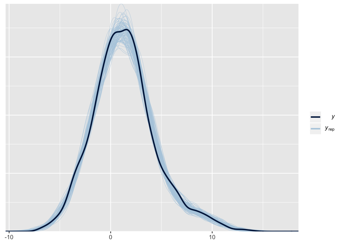
Estimating trends
Now that we have our posterior distribution of the paramters, given our data, we can ask of it the inferences it’s making.
new_dta <- expand.grid(x2 = seq(0, 1, length = 2000),
                       fac = c('1', '2', '3'))
predictions <- brms::posterior_linpred(mod, newdata = new_dta, summary = FALSE)

means <- apply(predictions, MARGIN = 2,mean)
lower <- apply(predictions, MARGIN = 2,quantile, prob = 0.055)
upper <- apply(predictions, MARGIN = 2,quantile, prob = 0.945)
Construct a df with the means and the quantiles, including the variable x2 and the grouping factor and plot the predictions.
We clearly see differences in each of these factors, as expected, but they’re also differing in regions where they change. For eg, from 0 - 0.25, both 1 and 2 have a similar trend, but 3 seems to be increasing.
data.frame(means) %>%
  cbind(lower) %>%
  cbind(upper) %>%
  cbind(new_dta) %>%
  ggplot(.,aes(x2, means, group = fac)) + geom_line(aes(color = fac)) +
  geom_ribbon(aes(ymin = lower, ymax = upper), alpha = 0.1)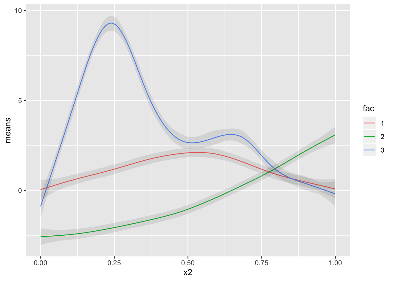
Estimating Derivatives
What if we’re also interested in knowing, what is the rate of change of a trend, and what areas show a signficant change in the rate of trends? Sometimes these changes aren’t immediately obvious, and we’d like to quantify the differences in the rates of change and their associated uncertainty.
As Dr. Simpson shows in his paper, we’ll use the method of finite differences. In a simple linear regression example, the rate of change is constant and that is the beta coefficient. However, for a non-linear trend, this rate of change, erm.. constantly changes.. Thus, we need to estimate the rate of change across the whole range of x2.
And the fact that we have a posterior distribution to work with, calculating the uncertainty intervals of the derivatives is easy - peasy.
Here we go -
We need to chose an epsilon, the difference at which we evaluate the derivative, to be small enough so we get a good approximation, but also large enough so we don’t get stuck in a computer hell.
epsilon <- 1e-6
first <- expand.grid(x2 = seq(0, 1, length = 4000),
                     fac = c('1', '2', '3'))

## We simply shift the second grid by a small amount, and evaulate predictions there
second <- first %>%
          mutate(x2 = x2 + epsilon)

## get predictions
first_preds <-
  posterior_linpred(mod,
                    newdata = first,
                    summary = FALSE,)
second_preds <-
  posterior_linpred(mod,
                    newdata = second,
                    summary = FALSE)


## Calcualte the differennce and divide by epsilon - this is analgous to the dx/dt
diff <- (second_preds - first_preds) / epsilon


## using the posterior samples, we calculate the mean and lower and upper quantiles
mean_finite_diff  <- apply(diff, MARGIN = 2, FUN = mean)
lower_finite_diff <- apply(diff, MARGIN = 2, FUN = quantile,prob = 0.025)
upper_finite_diff <- apply(diff, MARGIN = 2, FUN = quantile,prob = 0.975)
Now that we have our means in one hand, and the quantiles in the other, we can do the same thing we did for the trends, plot these and compare where the rates of change differ.
We can see that factor 1 has a much higher rate of change as compared to the others, but this rate of change is slowing down while eventually coming out to be close to the other factors.
data.frame(mean_finite_diff) %>%
  cbind(lower_finite_diff) %>%
  cbind(upper_finite_diff) %>%
  cbind(first) %>%
  ggplot(.,aes(x2, mean_finite_diff, group = fac)) + geom_line(aes(color = fac))  + geom_ribbon(aes(ymin = lower_finite_diff, ymax = upper_finite_diff), alpha = 0.1) + labs(y = "First Derivative", title = "Estimated First Derivatives")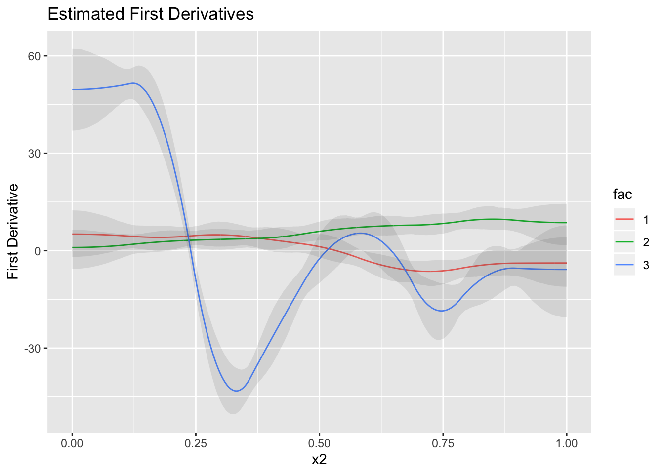
Conclusion -
Modeling linear relationships are great because not only do you see where they differ, the coefficients for each of the trends indicate how different their slope is. Doing so for non-linear models is not possible because the slope changes with every change in the predictor variable. This is where the method of finite differences comes into play allowing us to look at a large number of slopes at really really small intervals and assess where the changes happen.
Made possible by the powerful and versatile libraries mgcv ands brms!
